Clariant presents ColorForward® Interiors 2017
Clariant, a world leader in specialty chemicals, chose Heimtextil 2016, the international trade fair for home and contract textiles, as the venue for introducing ColorForward® Interiors 2017, the fourth annual trend and colour forecasting guide for the fibre and textile market.
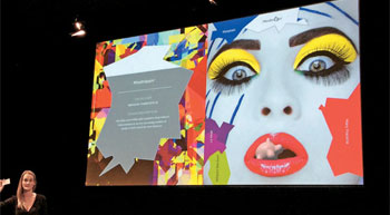
Clariant, a world leader in specialty chemicals, chose Heimtextil 2016, the international trade fair for home and contract textiles, as the venue for introducing ColorForward® Interiors 2017, the fourth annual trend and colour forecasting guide for the fibre and textile market. Clariant Designer Judith van Vliet, who works at ColorWorks® Europe/IMEA in Merate, Italy, made the presentation before more than 100 interested visitors on the third day of the conference.
ColorForward Interiors is an annual colour forecasting guide for producers of textile, yarn and filaments, and designers and manufacturers of textiles, upholstery and carpeting. It is derived from Clariant’s ground-breaking ColorForward trend-analysis and colour-design tool, which presents four global societal trends that can be expected to influence consumers and then links them to colours that evoke an emotional response related to each trend. The ColorForward Interiors presentation kit includes not only twenty basic trend colors, but also a like number of complementary colours. They are presented in the form of pompons made of polypropylene (PP) and polyamide (PA) fibres, and also “wrap cards†with polyester fibre samples. All fibres in ColorForward Interiors 2017 are dope dyed or spin dyed using Clariant masterbatches (color concentrates) to impart color to the yarn.
Van Vliet’s presentation – entitled “Clariant ColorForward 2017 Consumer Color Directions; Life is a trap!†– introduced the four trend themes for 2017. The colours for 2017 are more muted and earthier than in recent years, she told the Heimtextil audience. “We believe the mood is becoming a bit more fearful, more introspective and reflecting the disconnectedness that many people seem to be feeling today. There are some exceptions of course, but in general the colours are softer, darker and even ambiguous.â€Â
The ColorForward Interiors portfolio uses different materials in order to represent the diversity of regional and industrial segments in the fibres and textile market. The pompons are made from PP and PA in bulk continuous filaments (BCF) to create a texture that is favoured for carpeting made in Europe, the Middle East and North America. The polyester fibres on the wrap cards are produced as air-textured yarn (ATY), which is also commonly known by the old DuPont trademark, Taslan. ATY yarn is used in the automotive industry and also in furniture upholstery and clothing.

